The advice that doesn't fit deep tech
Most pitch deck guidance says the same thing: strip out the technical detail, investors don't need it. For deep-tech companies, that advice can remove the very thing that makes the product credible.
Take a product's topology. The standard advice is to get rid of it. But as presentation and brand designer Verril Martinez puts it, "for a technical product, the architecture is often what proves the product is real. It shows where the data comes from, how it's processed, where decisions happen and what safeguards are in place." That is credibility for investors. For executives in the room, it answers a different question: will this work with what we already have?
So the problem usually isn't the detail itself. It's how the detail gets shown — one dense diagram dropped on the screen all at once, leaving the audience to dissect it alone.
Motion as a storytelling tool, not decoration
Part of that problem comes from how graphic designers treat decks. Many see them as static documents and save motion for other platforms like After Effects. But a deck is presented live, one moment at a time, and PowerPoint can do more than it looks like at first glance.
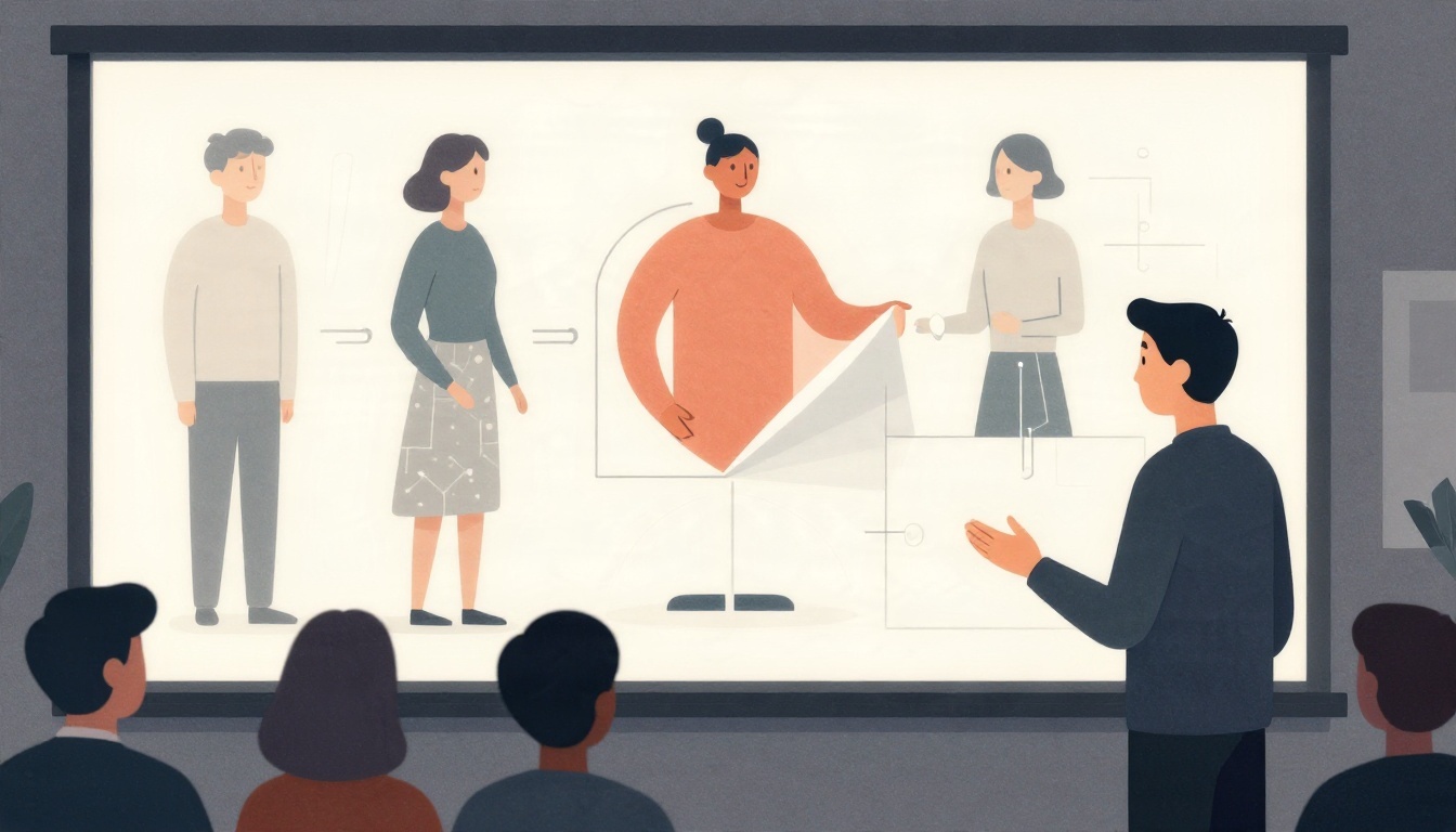
By incorporating tools such as Morph transitions, cropping, layering, and Adobe Illustrator and After Effects, a complex system can unfold piece by piece, in the same order the story is told. The audience follows the flow instead of decoding it. This is why Martinez uses motion in almost every deck: "A pitch shouldn't just introduce an idea, it should guide the audience through it, without pulling or tugging."
The two lives of a deck
Most decks have two lives: presented live by the founder, then forwarded and read alone. Online advice usually covers one or the other, but both should work hand in hand. Martinez designs the main deck for the room, with one clear point per slide, and moves supporting data into an appendix and a leave-behind. When a client wants more numbers on a key slide, he often builds both versions side by side.
The deck also has to physically work. Custom motion and video can push a file to hundreds of megabytes, and a stalled slide in front of investors undoes a lot of good design. Before every major presentation, he compresses the media, tests the file on a second machine, and sends a backup version as ppsx, mp4, and pdf.
Story before numbers and visuals
Founders often settle too early on the numbers and visuals before the story. They lock in the first explanation or diagram that made sense to their engineers, then build the whole deck around it. But what convinced an engineer isn't always what convinces an investor.
Instead, Martinez starts by deciding what investors need to believe to say yes, then locks the narrative and the visual system. Details change down to the last minute, so he builds flexible templates that can be updated without breaking the story. The best starting question is simple: what does a smart non-expert need to understand to say yes? Answering it honestly usually determines the first slide.
For teams building technical decks, the takeaway is not to cut the architecture — it's to sequence it. Show the system the way the story unfolds, design for both the live room and the forwarded file, and settle the narrative before the visuals. More of Martinez's work is at verrilm.com.
For further reading on pitch deck structure, see Sequoia's guide to writing a business plan and Y Combinator's advice on pitch decks.